Contrast Checker
Quickly and easily check color contrast
Normal Text – Example
Large Text – Example
Non Text Element (Icon)
Normal Text
Large Text
Non Text Elements
Input Options
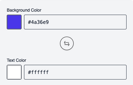
Simply enter the background and text color. The tool automatically checks whether the colors meet sufficient contrast requirements.
Questions?
General information about the Contrast Checker
This contrast checker verifies whether the combination of text color and background color meets the requirements of the Web Content Accessibility Guidelines (WCAG).
It shows if the combination is readable for normal text, large text, and non-text elements.
It shows if the combination is readable for normal text, large text, and non-text elements.
Good color contrast ensures that content is readable for everyone, especially:
– People with visual impairments
– People with color blindness
– Users in bright sunlight or on low-quality screens
Sufficient contrast is also legally required (e.g., WCAG 2.x, EN 301 549).
– People with visual impairments
– People with color blindness
– Users in bright sunlight or on low-quality screens
Sufficient contrast is also legally required (e.g., WCAG 2.x, EN 301 549).
– AA is the recommended minimum standard for accessible websites.
– AAA is a higher, optional standard for optimal readability.
In many countries and projects, WCAG AA is the relevant target.
– AAA is a higher, optional standard for optimal readability.
In many countries and projects, WCAG AA is the relevant target.
Large or bold text is easier to read.
WCAG allows lower contrast values here without compromising readability.
WCAG allows lower contrast values here without compromising readability.
According to WCAG, text is considered “large” if it is:
– at least 18 pt (≈ 24 px) or
– 14 pt (≈ 18.5 px) and bold.
– at least 18 pt (≈ 24 px) or
– 14 pt (≈ 18.5 px) and bold.
Non-text elements include:
– Icons
– Buttons without text
– Graphical symbols
– UI elements that convey meaning.
– Icons
– Buttons without text
– Graphical symbols
– UI elements that convey meaning.
For non-text elements, WCAG requires a minimum contrast of 3:1 to ensure their function is recognizable.
Yes.
You can either:
– Select colors via the color picker, or
– Enter them directly as a HEX value (e.g.,
Both inputs remain automatically synchronized.
You can either:
– Select colors via the color picker, or
– Enter them directly as a HEX value (e.g.,
#1a1a1a).Both inputs remain automatically synchronized.
This button swaps text and background colors.
It allows you to quickly check if both variations meet WCAG requirements.
It allows you to quickly check if both variations meet WCAG requirements.
The checker works live.
Every color change is calculated instantly so you can see if the contrast is sufficient.
Every color change is calculated instantly so you can see if the contrast is sufficient.
No.
The contrast checker is a helper tool for evaluating color contrast.
A full accessibility audit also includes:
– Keyboard accessibility
– Screen reader compatibility
– Focus management
– Structure & semantics.
The contrast checker is a helper tool for evaluating color contrast.
A full accessibility audit also includes:
– Keyboard accessibility
– Screen reader compatibility
– Focus management
– Structure & semantics.
Calculations are based on WCAG 2.x contrast rules, which are also used in current legal requirements (e.g., EN 301 549).
This tool is suitable for:
– Web designers & developers
– Editors & content managers
– Agencies
– Companies with accessibility obligations
– Anyone who wants to ensure better readability.
– Web designers & developers
– Editors & content managers
– Agencies
– Companies with accessibility obligations
– Anyone who wants to ensure better readability.
– Use darker text on a light background (or vice versa)
– Increase brightness difference
– Use larger or bolder fonts
– Avoid similar gray tones.
– Increase brightness difference
– Use larger or bolder fonts
– Avoid similar gray tones.
Not necessarily.
Very strong contrasts can cause eye strain.
The goal is sufficient contrast, not maximum contrast.
Very strong contrasts can cause eye strain.
The goal is sufficient contrast, not maximum contrast.